HTC 2020
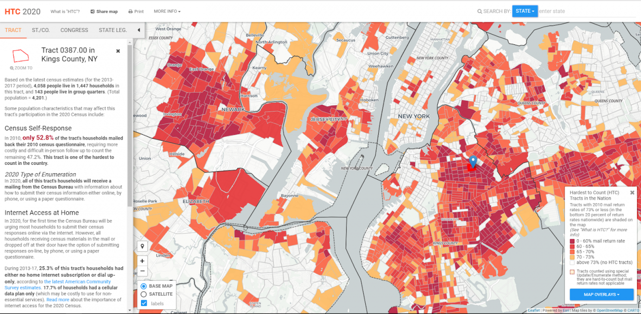
This highly-detailed map highlights areas of the country that are hardest to count, and provides information to local, regional, and national governments and organizations to ensure that hard-to-count areas and populations are fully counted, to guarantee a fair and accurate census.
Stats
Dataset(s): Multiple datasets, including Census Bureau 2010 mail return rates, demographic information from 2013-2017 American Community Survey, and public library branch locations from the Institute of Museum and Library Services.
Visualization: Data Analytics, Map, Predictive Analytics
Jurisdiction: United States
Developed by: City University of New York’s Graduate Center
Map Monday: Who Will Count in the 2020 Census?
July 8, 2019 Data Visualization Do you count? Most people would make the assumption that they do, on some level or to someone. But it’s possible that the federal government has a different answer than your friends and family; you might not count to it at...

