At Data-Smart City Solutions we have recently developed a framework for reducing place-based inequity, informed by the experience of chief equity officers on the ground in many cities. We believe that this framework can drive important actions at the local level, as it represents a comprehensive all-of-government approach that is informed by data and community participation. Of course, a comprehensive effort will encounter several challenges, the obvious ones being budget and political support. Equally important, although less obvious, are the internal structural barriers that center on the need for more vivid an understanding of the underlying conditions and the task of uniting multiple agencies around common definitions, shared data and coordinated actions.
Tucson, Arizona’s Office of Equity was established in 2022, yet has already made significant strides in addressing those structural barriers. Under the direction of inaugural Chief Equity Officer Laurice Walker, the office has orchestrated strategies that are based on a data visualization framework that synthesizes complex information and provides a collaborative platform that functions across organizational silos.
“The direction for the Equity Office was to look at our organizational practices, service delivery, and policies to make sure that the services that we’re offering to our constituents are truly accessible,” explained Walker, “and a big piece of my framework when I came in was looking at the data.” One of the primary benefits of data visualization in the context of equity work is the ability to democratize information and foster a shared understanding of the challenges at hand. Walker had previously served in equity roles in other cities and knew that the new office needed to both understand current practices and how chart the path for future actions and goals. Both those goals required data, so Walker brought on Laura Sharp to be the equity data project manager.
Sharp had held previous roles in the city of Tucson, including serving as the lead planner in the Housing and Community Development Department. In her role with the Office of Equity, Sharp can influence policy making on a much broader scale. “I'm here to not only use data to make decisions, but also to help others in the city figure out how they can use data in their own work,” she said, adding “our goal is to affect not just the big decisions, but also the everyday decisions that city staff make.”
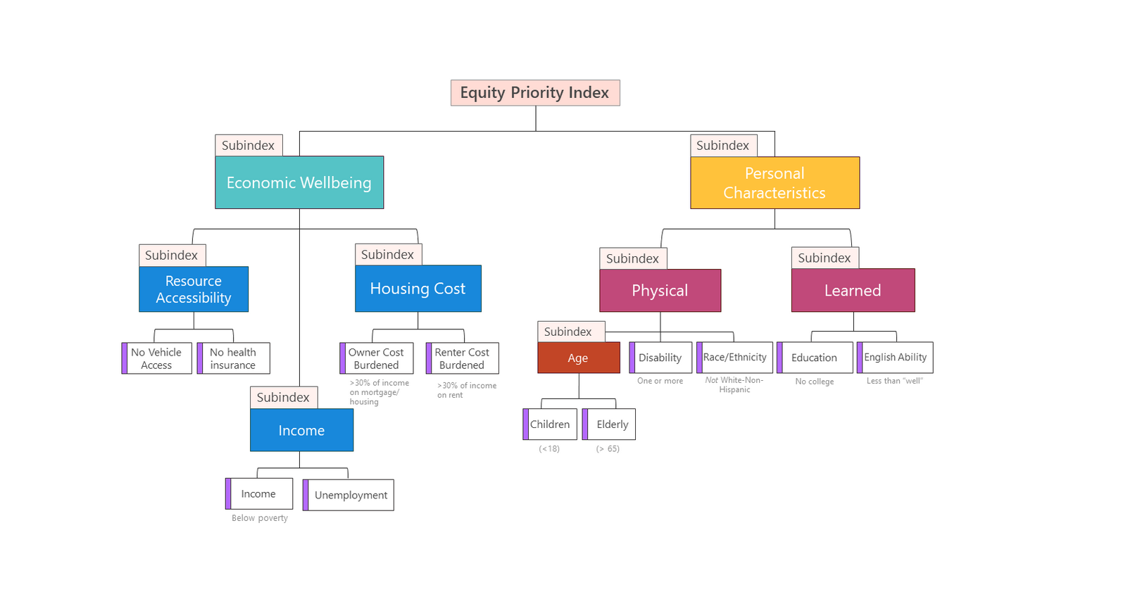
When departments across the city have access to visual representations of equity metrics, it becomes easier to track progress, identify areas for improvement, and hold stakeholders accountable for their contributions towards equity goals. Data visualizations serve as catalysts for innovation and targeted interventions. Much work and difficult decisions go into collecting and presenting data before other departments can easily incorporate the information into their work. Walker and Sharp chose to build a foundational model, the Equity Priority Index, which serves as a base instrument to combine multiple measures of vulnerability.
While other indices existed, combining multiple vulnerability factors in a single, composite index meant that all departments could move forward with their agency’s equity work confident that other officials had the same baseline understanding. “We chose twelve different demographic factors that are understood to contribute to vulnerability,” said Sharp, “and by vulnerability we mean communities that are more likely to be harmed or negatively affected” by social, economic, and environmental setbacks. By superseding the older indices, which defined vulnerability or inequity with different or inconsistent criteria, the Equity Priority Index consistently guides work across many departments.
Sharp and Walker chose to keep the Index “strictly demographic” rather than overlay other data points, the way something like an opportunity index might. An opportunity index would take the demographic information on vulnerability and couple it with data on local assets like parks and schools, whereas the Equity Priority Index presents specific information strictly on the demographic factors that relate to vulnerability (e.g. no vehicle access, housing cost burdened, or disability status). This strategic decision means that “the departments and programs can bring in their own asset data like sidewalk quality, broadband coverage, or the existence of trees and compare it with the demographic vulnerability to determine if all residents have access to these services regardless of their socioeconomic status,” said Sharp. This flexibility makes it easier for individual departments to bring in their relevant data and create a more focused approach.
The Index will be routinely updated, guaranteeing that all departments are using accurate data. This means that changes can be benchmarked over time, providing valuable insight on what projects or initiatives are working. The city also uses an online survey, to help weight the Index, that asks questions in a “would you rather” format with two options inquiring, for example, what makes a person more vulnerable: “no insurance or no car,” and carefully writes the questions to avoid labeling residents or invading their privacy. Centering all city agencies and departments on agreed-upon, timely metrics prevents equity from falling through the cracks or being incorrectly addressed at different departments. “We now have a shared terminology and understanding of what this work means,” said Walker, “and it creates opportunities to measure results year-over-year internally across departments and to see how our progress compares to regional and national trends.”
The public benefits from this streamlined and standardized Index. Not only does it represent a real commitment to increasing equity from the city, but it also allows the public into a process that can seem opaque or vague. “We have a shared terminology understanding of what this work means both internally but also externally with our community champions,” said Walker “We want to make sure that the community is aligned when we talk about equity and what this means.”
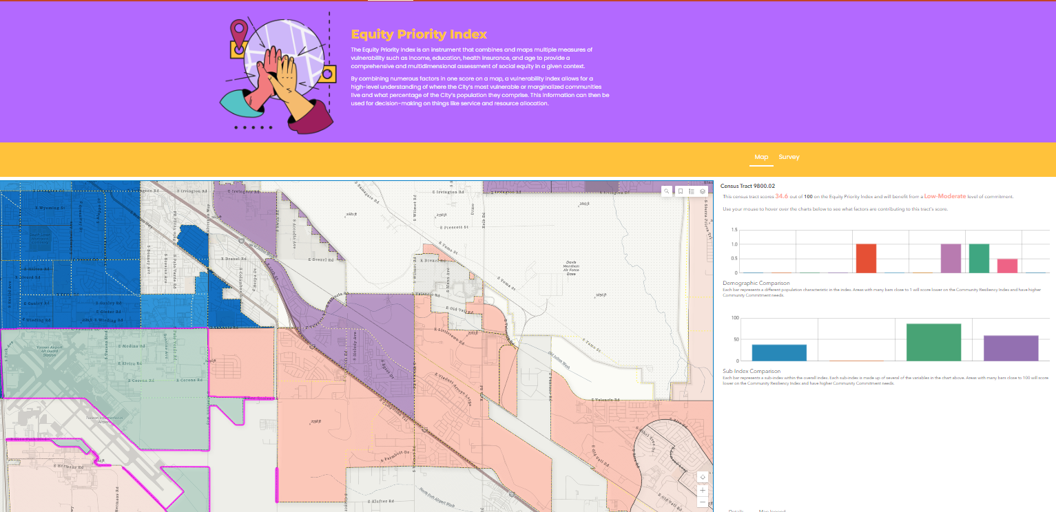
This comprehensive Index is one of the pillars behind the Tucson Equity Data Strategy (TEDS), the overarching method for collecting, tracking, and analyzing data to advance equitable outcomes. The TEDS toolkit includes the Index, shown above, plus templates for equitable data collection standards, a low entry "point-and-click" demographic lookup app, and a forthcoming Open Equity Data Hub.
Of course, all this data and mapping needs to be infused in day-to-day policies in order to make a difference. The city uses TEDS in its budget and capital plans to assist communities that have not historically received investments to receive city resources and services. “If you're in a high or moderate high priority zone, your application is going to get more points,” Walker explained “and we use the maps to transparently explain in public meetings how we made a decision.”
According to Sharp, the Index has the biggest potential to impact how funding is spent. Right now, a city department can look up demographic information by Census tracts on the Index and match that data with information on their specific interest. For example, if employees in the Parks Department wanted to check equitable access to green spaces for youth and people with disabilities, they could pull up data on age and physical disability from the Index and compare with their own information on park locations. If they find a gap in access, the Parks Department could then direct resources to that area.
The Equity Priority Index uniquely establishes a shared base of demographic data while allowing and assisting departments to input their own data to guide their own work. “I think we have a uniqueness with our work,” said Walker, “of using data to really put into narration the lived experience of our community.”
About the Author
Betsy Gardner
Betsy Gardner is the editor of Data-Smart City Solutions and the producer of the Data-Smart City Pod. Prior to this, Betsy worked in a variety of roles in higher education, focusing on deconstructing racial and gender inequality through research, writing, and facilitation. She also researched government spending and transparency at the Lincoln Institute of Land Policy. Betsy holds a master’s degree in Urban and Regional Policy from Northeastern University, a bachelor’s degree in Art History from Boston University, and a graduate certificate in Digital Storytelling from the Harvard Extension School.