
Equity as Practice, Not Product
On May 9th the Data-Smart team traveled to Redlands, California to attend the Esri Public Sector CIO Summit. Over the next two days the team attended various sessions about mapping and geographic information systems (GIS), public sector technology, and institutionalizing equity in local government operations. On Wednesday afternoon we had the opportunity to sit down with Tacoma’s Chief Technology Officer Grace Brosnon and Director of IT/Chief Information Officer Daniel Key after their presentation on the city’s award-winning equity mapping work.
Tacoma is a mid-sized urban port city that sits along the Puget Sound with a population of over 210,000. The third largest city in the state of Washington, it is a diverse, progressive international gateway to the Pacific Rim. Tacoma is committed to addressing inequities in the areas of workforce, service delivery and community engagement, with a focus on communities that have historically been underserved. During their talk Brosnon and Key presented an unflinching look at the history of the city which, as many American cities are, is situated on stolen Indigenous lands (the Puyallup people in this case) with a history of redlining and blocking home buying for Black residents, practices which established “inequities in loans, services, schools, and living locations for people of color.”

Many residents and local leaders wanted to increase equity to address the historic injustices but recognized the need for a more detailed understanding and accurate measurement of where, why, and what inequities exist. According to Key, who joined the city five years ago, this intentional equity focus gained serious traction with the last community-driven visioning process in 2015. The resulting document, the Tacoma 2025 plan, demonstrates this commitment. Every single theme in the strategic plan is underlined with an equity goal, explaining how a point like ‘government performance’ or ‘arts and cultural vitality’ is related to, and will strengthen, equity and accessibility.
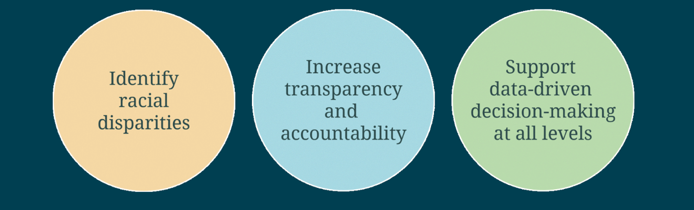
The next step of this work was to develop a framework and common measure to track the plan’s progress. In 2018 Tacoma’s Office of Human Rights partnered with the Kirwan Institute for the Study of Race and Ethnicity at Ohio State University to develop an opportunity index, with three general goals related to the Tacoma 2025 plan. This work evolved over the next few years, to what is now known as the Tacoma Equity Index. For Brosnon, who joined the city almost a decade ago as an IT manager, “That’s the hardest part — not the technology, but taking the vision and understanding how that applies to the goals.” Once the city established this framework, Brosnon and Key were pulled in for the next stage: tracking the vision of an equitable Tacoma against measurable targets.
Visualizing and Mapping Equity
Brosnon always says that she “doesn’t solution at the beginning.” Rather, she learns about the problem while being agnostic about any kind of technology solution or digital tool. In building out the tracking and measurements required for the equity index, she wanted to make it interoperable and easy to integrate into itself, for when different departments needed to overlay or add specific details. “I didn’t want the tech to be the barrier,” she said.
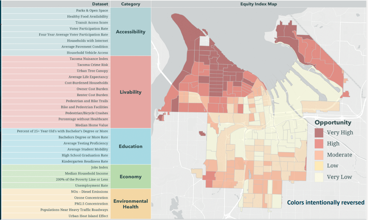
The city has built out an interactive Equity Index map using ESRI and integrated it as a map layer and dataset in other analytics tools such as Tableau and Snowflake. The idea is to create the technical infrastructure to be able to use the Equity Index regardless of the toolset so that it is not the technology that prevents us from applying the Equity Index to the use case. The result is an Equity Index map. The city now has dozens of use cases where the Equity Index has come into play as one of the tools used to make decisions.
Externally, these visualizations gave the city more opportunities to share and engage with the public. “We’re having better discussions now,” said Key, “we’re not talking ‘is [inequity] even a thing?’ but rather policy specifics: ideas about solving, moving forward to the next question rather than pushback on ‘equity’ as a term.” Understandable, transparent data and maps help residents who might be prone to doubting the problem or dismissive of inequities move past their hesitancy and literally see the issues facing low-income residents or communities of color in Tacoma.
Design and User Experience
While these maps are understandable and clearly visualized, there is one unique and initially surprising design choice; the colors are intentionally reversed. Typically, “problem” areas on a map are the darkest shade, often red, with the “better” areas the lightest version of that color. This inversion is actually a key part of the user experience.
On a standard map, the viewer's eye is typically drawn first to the darkest shade, and dark colors are traditionally seen as the highest concentration of the value being mapped. For example, a quick search for ‘where is the worst air pollution’ will yield dozens of maps that show areas with the worst air pollution as deep, dark red with cleaner areas lighter shades of orange and yellow. Especially when mapping inequities, which often shows where health outcomes are poor, incomes are lower, and educational attainment is below average, the traditional map uses the deepest shades for the worst places. Yet that standard convention can reinforce the idea that dark = bad and light = good, a form of unconscious racial bias.
“We uncovered that bias when we decided to flip colors and visually exercise looking at things differently, not just identifying dark red as a bad or problem area,” reported Bronson, “It does hit your brain differently, and it makes you reflect differently.” The city’s Office of Human Rights and partners from the Kirwan Institute also chose to highlight “opportunity areas” rather than using language that’s typically negative like poor, less, worse, etc. “An unintended consequence of processing this slightly differently makes you refocus better and invites you to explore more,” Key added, “Systemic racism and conventions perpetuate certain behaviors, so you have to reverse that.”
Proof is in the Projects:
Over the past couple of years, many projects and policies have come from using the Equity Index tool. The maps have guided decisions from where to hold city meetings to where to plant trees for heat mitigation to underwriting economic development microloans.
Two examples shared by Key and Bronson were tied to infrastructure. Equitably building, managing, and repairing infrastructure is a massive responsibility in cities across the US thanks to substantial federal funding over the past few years. In 2019, shortly after the Equity Index map was created, Tacoma’s Department of Public Works (PW) had $200,000 to spend on adding 200 new streetlights, and PW wanted to be thoughtful about how they prioritized installation, with safety as the key factor. The GIS team helped map out information on nighttime accidents, schools, and high rates of crime which resulted in the map on the left. Yet when this data was given an equity multiplier, a slightly different map emerged, shown on the right.
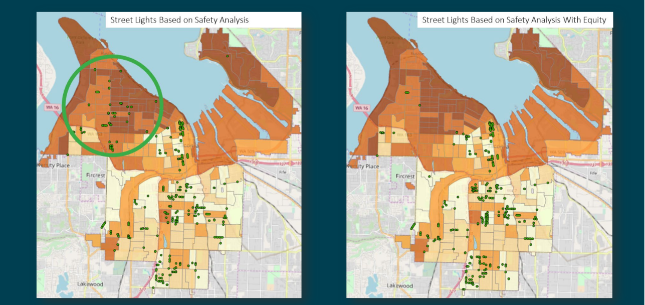
The darker areas in the upper left quadrant of the map are higher income high-opportunity areas, and when the team reviewed the data with the equity layer, discovered that there were more car trips in that area and many folks in that area drove children to school. In contrast, many residents of the lighter, lower quadrant relied on public transit or walking, activities that require more and better street lighting.
The city took a similar approach to installing advanced metering infrastructure (AMI). According to the US Department of Energy, AMI is “an integrated system of smart meters, communications networks, and data management systems that enables two-way communication between utilities and customers” which can help identify outages more quickly, manage personal energy consumption, and help reduce demand during peak times. Due to supply chain issues during the COVID-19 pandemic, the city only received half of their initial meter order. Thanks to the equity map overlay, the Tacoma Public Utility side of the city could prioritize low- and very low- income neighborhoods for the first wave of AMI placement. This allows those customers to receive the direct benefits for relevant alternate billing, budgeting, and customer service offerings ahead of other program benefits.

Key and Bronson have been recognized for, as they call it, their “practical innovation work” with various accolades including the Special Achievement in GIS award from Esri. Yet they’re most proud of the way this data map makes equity an integral part of governance and policymaking in Tacoma: not a check-the-box activity but a practice.
About the Author
Betsy Gardner

Betsy Gardner is the editor of Data-Smart City Solutions and the producer of the Data-Smart City Pod. Prior to this, Betsy worked in a variety of roles in higher education, focusing on deconstructing racial and gender inequality through research, writing, and facilitation. She also researched government spending and transparency at the Lincoln Institute of Land Policy. Betsy holds a master’s degree in Urban and Regional Policy from Northeastern University, a bachelor’s degree in Art History from Boston University, and a graduate certificate in Digital Storytelling from the Harvard Extension School.